Direct answer
Direct printing places the approved graphics on the kraft-paper surface, so the visible package keeps its paper texture and the print is judged on the actual white, natural-brown, or black paper. A film-printed laminate prints the graphics on a separate film and then laminates that film to paper. Both routes can produce functional coffee bags, but they create different color, texture, finish, construction, and cost decisions.
What is the difference between direct-to-kraft and film-first printing?
With direct-to-kraft printing, the paper is the print surface. The grain, fibers, absorbency, paper color, ink, coating, and converting temperatures are therefore part of the color-management plan. This route is useful when the brand wants consumers to see and feel real paper rather than a smooth printed film over the paper.
With a film-first laminate, graphics are printed on a thin film and the printed web is laminated to kraft paper. The film can provide a controlled printing surface and can protect reverse-printed graphics, but it changes the visible and tactile result and adds a film layer to the construction. The correct choice depends on the design, barrier route, order size, converting process, and environmental objective.
How do white, brown, and black kraft paper affect color?
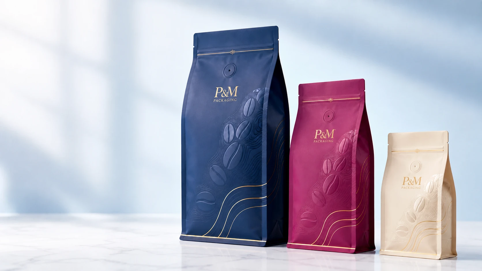
White kraft is the strongest starting point for bright multi-color work and CMYK image reproduction. P&M can print CMYK graphics directly on qualified white kraft so photographs, gradients, and brand colors can be reproduced close to the approved design while the paper texture remains visible.
Natural brown kraft becomes part of every unbacked color. It warms light colors, reduces contrast, and can create an intentionally natural appearance. Black kraft requires a contrast strategy: opaque screen-printed white, metallic foil, selected spot colors, or a controlled white underbase may be used instead of expecting ordinary CMYK inks to remain bright on the dark sheet.
- White kraft: best starting point for CMYK images and brighter brand colors
- Natural kraft: visible fiber, warmer color, and a deliberately muted craft appearance
- Black kraft: strongest with opaque white, metallic foil, selective gloss, and simplified high-contrast graphics
Combine CMYK with white ink, UV, foil, and embossing
The finish plan should support hierarchy rather than cover every panel with effects. CMYK can carry the main illustration or photography; screen-printed white can create opaque, slightly raised details; spot or screen UV can add selective gloss; cold or hot foil can highlight a logo; and embossing can give a controlled tactile accent.
Each finish needs its own artwork layer, registration allowance, tooling, and production review. Embossing should avoid seals, zipper tracks, valve positions, fine legal copy, and areas that could be flattened during filling or distribution. A production proof or material drawdown is more useful than judging these effects only on a monitor.
Control water resistance, heat exposure, and color stability
Coffee-bag converting exposes printed paper to handling, lamination or coating steps, friction, and heat during bagmaking. P&M selects qualified ink and surface systems for water resistance and the intended converting-temperature range so the approved colors remain stable through the specified process.
These properties must still be confirmed on the exact paper, ink, coating, adhesive, construction, and converting route. A test made on one white kraft grade does not automatically approve another natural or black paper, and a material-level result does not replace finished-bag review.
Which designs are best for direct printing on kraft paper?
Direct printing is especially effective for brands that want visible paper texture, tactile restraint, a premium natural surface, limited film in the print layer, or a consistent shared design across coffee SKUs. White kraft supports the widest image range; natural and black kraft reward designs that deliberately use the substrate as a color.
Before artwork approval, identify the kraft grade and shade, target colors, white-ink areas, finish layers, valve and zipper zones, seals, folds, and any variable SKU information. The production team can then recommend a direct-paper or film-first route instead of changing the artwork after proofing.
General educational information only. Materials, performance, compliance, claims, quantities, and timing require confirmation for the exact packaging project.